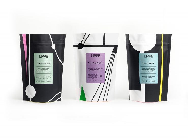
Norwegian coffee company Temperato roasts coffee under their LIPPE branding and works with artist and coffee-enthusiast Henrik Placht for their gorgeous coffee packaging. The designs draw upon Russian Constructivism, German Bauhaus, and French pumps. We love it! We talked to Philip Skopakov to learn more.
Tell us a bit about your company.
The company was established in 1998 by Alexander and Pia von der Lippe. They were delivering equipment to the Norwegian domestic market, primarily the Rancilio Silvia espresso machine and the Rocky grinder. Both Alexander and Pia were students at the time, finishing their Masters in Molecular Biology and Biochemistry respectively. The business grew organically from that point onward. Alexander did paper rounds and Pia taught part time to provide for themselves and their two small boys or to make ends meet in the early days. In 2002 the business had finally grown enough to provide for the family and the couple opened a small specialty shop in the Bislett area of Oslo, providing the market with all sorts of gadgets and coffee for domestic use whilst also slowly starting to supply to the professional market.
During 2006 they started planning for their own roastery, a dream that had been with them since the beginning. A brand new 15 kilo Joper roaster was installed in 2007 and the story continued. Coffee branded as LIPPE was well accepted by the market from day one and ever since, roasting volumes have steadily grown.
When did the coffee package design debut?
The first LIPPE design was launched back in 2008 and the present design was launched at the Gothenburg world of coffee trade show in 2015. The story behind the present design goes back a bit in time though:
In autumn 2013 the artist Henrik Placht, who lives in the neighborhood of the roastery, came by to get his Rancilio Silvia machine repaired. He was given a tour of the roastery and then suggested that the LIPPE packaging design should be taken to a higher level, to match the quality of the coffee. The idea lay dormant for some time, until almost one year later, Pia picked up the phone and asked Henrik if he would be interested in decorating the world’s most beautiful and fantastic coffee packaging.
Who designed the package?
Henrik was extremely excited about the project and started cooperating with the designer Anders Hofgaard from NODE Berlin’s Oslo office. Several of Henrik’s paintings were considered as inspiration for the design, but one painting in particular stood out:
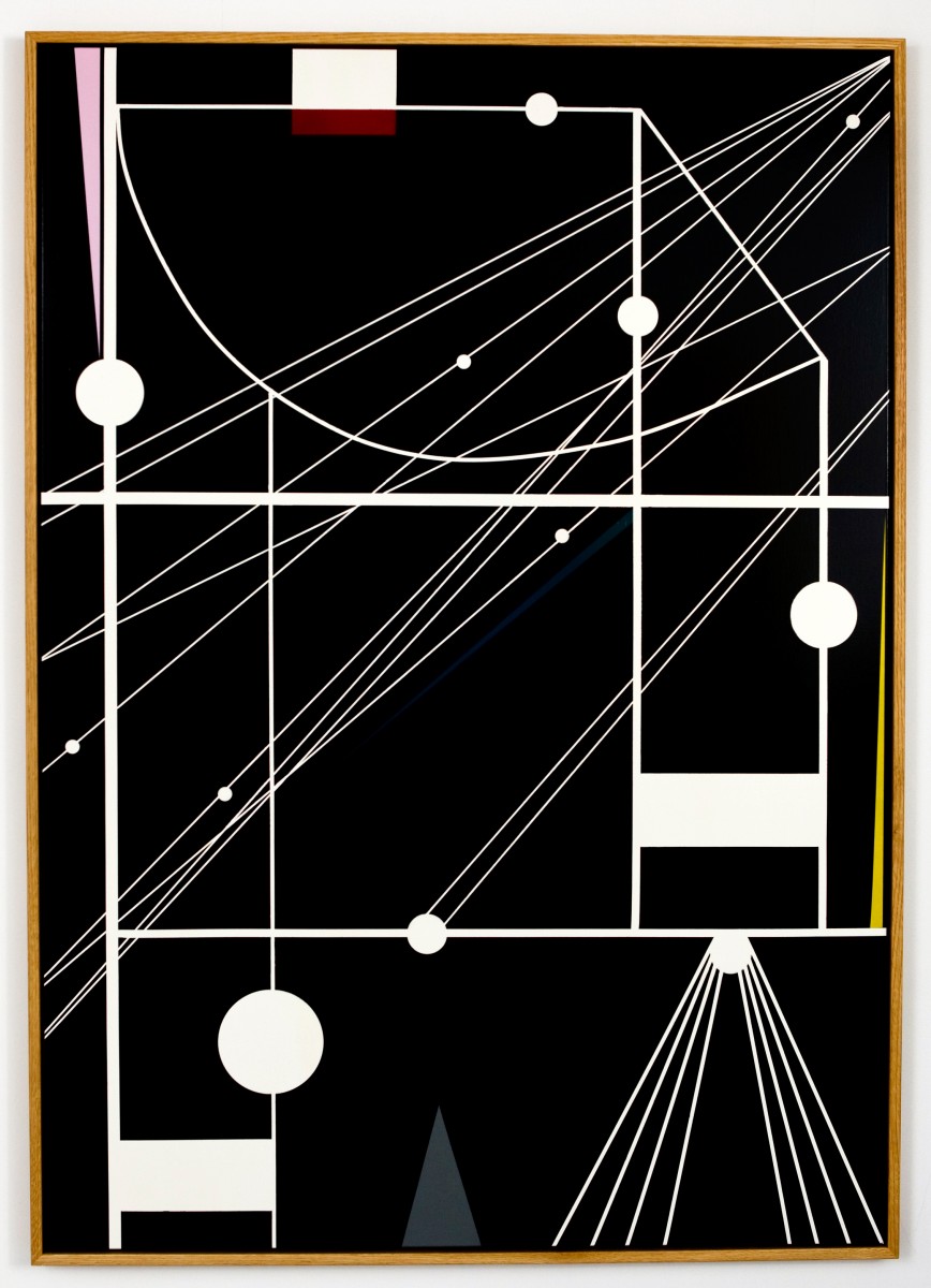
[Image via: Galleri Hakken]
“The bag designs come from a painting that has a visual language that refers to Russian Constructivism and draws from German Bauhaus aesthetics. The original artwork was originally 3 pieces about totalitarian states and human evil.” Henrik continues “It’s really strange that it ended up on coffee bags…”
One more thing that is important to mention is the reason why the bags have neon colours on the base. That is because of Henrik’s love for Christian Louboutin shoes for women. He says, “I think he makes really sexy shoes and I was thinking how could I steal that little thing that he has with the red underneath. So I just did the same with the bag, matching three different neon colours that go together with the design, colours and the lane colour palette too.”
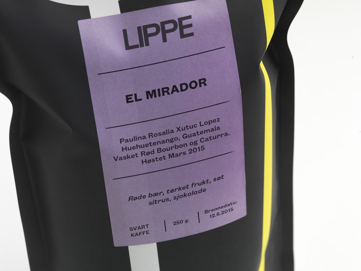
What coffee information do you share on the package?
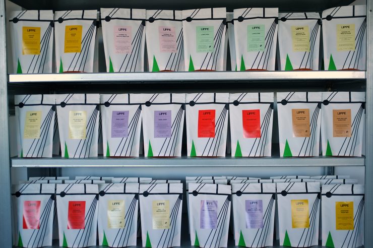
The sticker on the coffee bags contain a short taste description, geographical data, info about the farmer, type of processing, variety, weight, date of production and intended type of use (filter or espresso). For the teas, there is a taste description, origin, content and a recommended brewing time and temperature.
What’s the motivation behind that?
The idea is to keep the information on the label short and easily understandable, keeping only the essentials of taste, origin and processing.
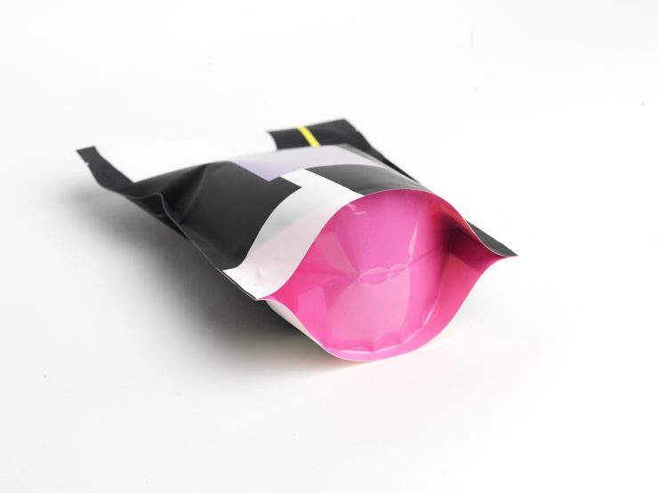
Where is the bag manufactured?
The bags are produced in South Korea in cooperation with Dutch Pack.
For package nerds, what type of package is it?
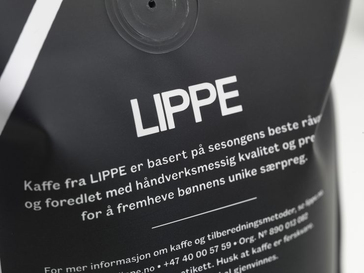
Our 250 gram bags are doypacks with a tear notch for easy opening. From this year also a laser cut with a re-sealable zip lock. The 1 kg bags are called quadro seal and are side folded. All the bags except the tea bags have valves to let excess gases out. The bags are matt varnished and consist of two layers, PET (Polyethylene terephthalate) and PE-EVOH (Polyethylene Vinyl Alcohol).
Is the package recyclable/compostable?
The bags do not contain aluminum so they are completely recyclable or can be used as an energy source.
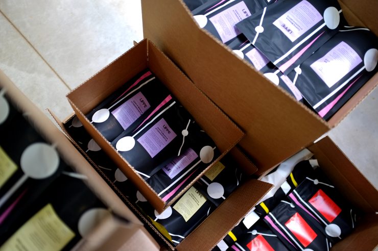
Where is it currently available?
The coffee is available through our web-store, as well as cafés, bakery outlets and coffee shops throughout Norway. We are also regularly featured in Kaffebox‘s roaster of the month. We are currently considering other coffee subscription services. Send us a message if you would like to see our coffees in your next coffee delivery!
Thank you!
Company: LIPPE Kaffe
Location: Oslo
Country: Norway
Design Date: 2015
Designer: Henrik Placht
Location: Oslo
Country: Norway
Design Date: 2015
Designer: Henrik Placht
Nice Package is a feature series by Zachary Carlsen on Sprudge. Read more Nice Package here.
Photos provided by Lippe and photographed by Jonni Studios.
The post Nice Package: Lippe Kaffe In Oslo, Norway appeared first on Sprudge.

